

Photo by Artem Sapegin on Unsplash
CSS - Flexbox 101
For newbies and seniors that had forget the basics of flexbox.


Table of contents
The Basic Structure.
If this is the first time you are working with CSS, and specifically with Flexbox, this post is for you and me. ¡So let's get to it!
Flexbox is a system created to make web layouts in rows or columns work responsively. So we don't have to worry that much if the end-user is on his mobile phone, tablet or laptop, or desk PC screen. Flexbox will adapt the layout automatically to the screen size. So we will need an example for this: First let's make a basic Html structure like the following.
<!DOCTYPE html>
<html lang="en">
<head>
    <meta charset="UTF-8">
    <meta http-equiv="X-UA-Compatible" content="IE=edge">
    <meta name="viewport" content="width=device-width, initial-scale=1.0">
    <link href="css/style.css" rel="stylesheet">
    <title>CSS Flexbox 101</title>
</head>
<body>
    <div class="container">
        <h1>How to use CSS <span>Flexbox 101</span></h1>
        <img src="/img/Banner1.png" alt="CSS Flexbox 101 banner">
        <div class="columns">
            <div class="col">
                <h2>Ipsum Dolor Sit Amet</h2>
                <p>Lorem ipsum dolor sit amet, consectetur adipiscing elit. Fusce condimentum lobortis quam eu facilisis. Morbi ex mauris, malesuada vel ante ac, scelerisque rhoncus sem. Vestibulum ipsum mi, dapibus nec posuere sed, dignissim vitae ligula. Pellentesque non sem imperdiet, tincidunt erat et, pellentesque elit. Etiam convallis dui sed nibh fermentum, vitae eleifend felis rhoncus. </p>
            </div>
            <div class="col">
                <h2>Aliquam erat volutpat.</h2>
                <p>Lorem ipsum dolor sit amet, consectetur adipiscing elit. Fusce condimentum lobortis quam eu facilisis. Morbi ex mauris, malesuada vel ante ac, scelerisque rhoncus sem. Vestibulum ipsum mi, dapibus nec posuere sed, dignissim vitae ligula. Pellentesque non sem imperdiet, tincidunt erat et, pellentesque elit. Etiam convallis dui sed nibh fermentum, vitae eleifend felis rhoncus. </p>
                <p>Proin egestas felis non venenatis tempor. Phasellus eros purus, tempus vitae condimentum nec, tincidunt id risus. Curabitur ex libero, egestas eget velit non, faucibus fringilla orci. Nulla congue dolor quis ipsum ornare vestibulum. Donec fringilla porta erat.</p>
            </div>
            <div class="col">
                <p>Maecenas aliquet venenatis est, sed porta libero consectetur in. Ut justo ex, ultricies nec posuere quis, accumsan quis magna. Nulla pharetra nisl ut dolor pretium, sed congue neque vestibulum. Lorem ipsum dolor sit amet, consectetur adipiscing elit. Nulla facilisi. Pellentesque porttitor lacus sed malesuada tempor. Maecenas tristique tortor dapibus neque mattis convallis. Vestibulum et dapibus lorem.</p>
            </div>
        </div>
        <div class="columns">
            <div class="col">
                <h2>Duis nec fermentum mi</h2>
                <p>Vivamus imperdiet nec magna sit amet scelerisque. Aenean elementum neque id auctor semper. Pellentesque condimentum purus et diam lobortis, a vehicula ante volutpat. Suspendisse molestie est in odio porta, eu tempor tellus porttitor. Ut lobortis dignissim fermentum.</p>
            </div>
        </div>
    </div>
</body>
</html>
Ok and now some basic CSS code to start...
html, body {
 margin: 0px;
 padding: 0px;
 font-family: -apple-system, BlinkMacSystemFont, 'Segoe UI', Roboto, Oxygen, Ubuntu, Cantarell, 'Open Sans', 'Helvetica Neue', sans-serif
}

img {
    width: 100%;
}

h1 {
    color: #455d7a;
    font-size: 2.5rem;
    margin: 0 auto;
    text-align: center;
}
h1 span {
    color: #f95959;
}

h2 {
    color: #a83737;
    font-size: 1.5rem;
}

.container {
    color: #233142;
    margin: 0 auto;
    padding: auto;
    max-width: 800px;
}
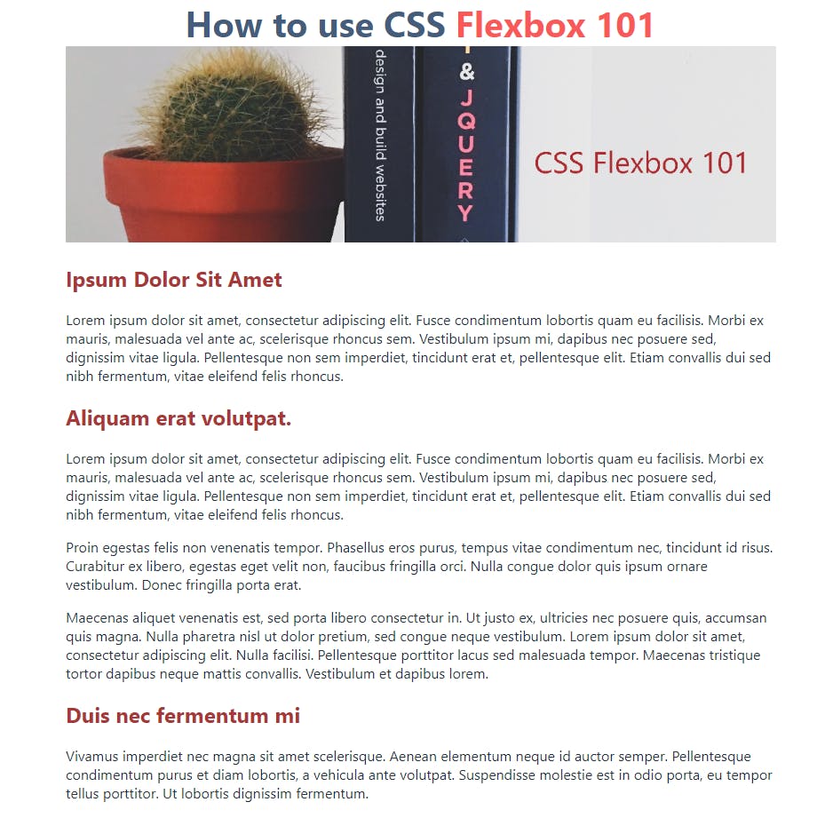
You should get something like this:
The CSS Flexbox in use.
Now let's use the Flexbox system. Write in your CSS file a new class named ".column" and write the flexbox command as follows:
.columns {
display: flex;
}
Now we get the following columns alignment on our blog.
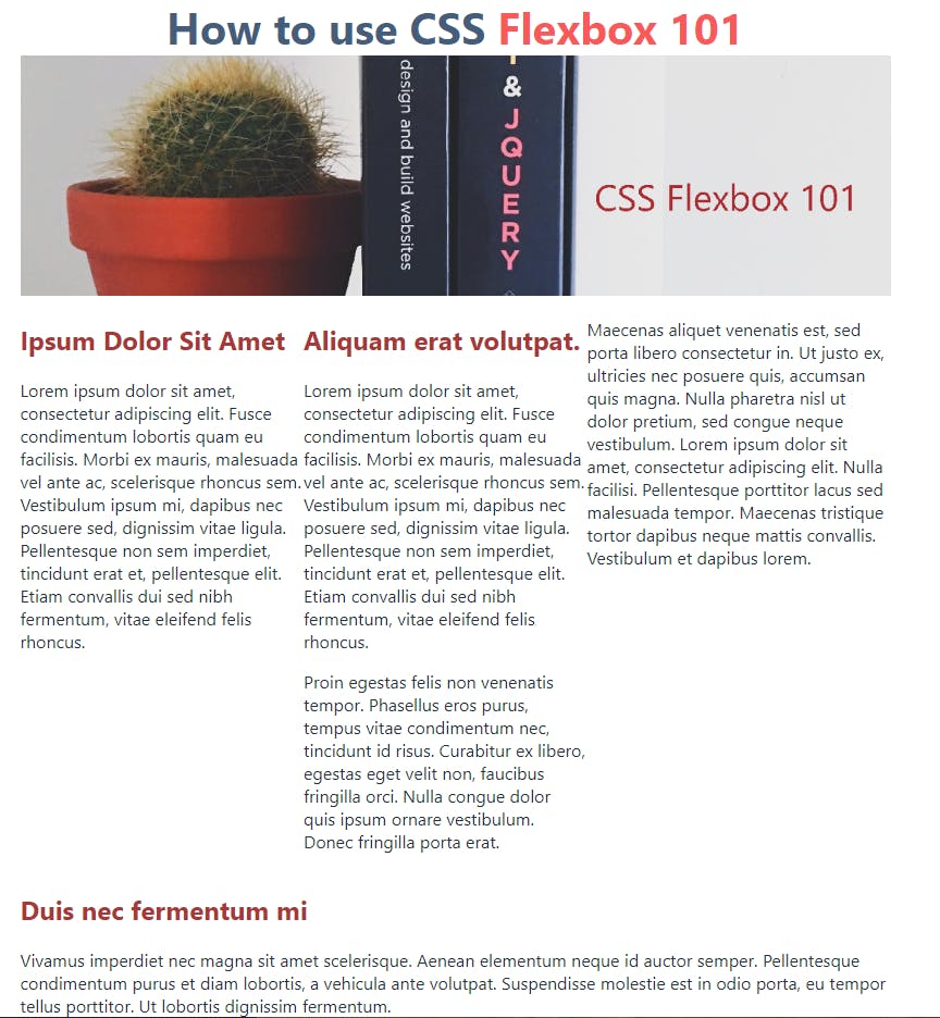
There we go. Now we have a real example of what the CSS Flexbox property makes. That's all for this post. In the following post, I will show how we can make some space between the columns with a simple flexbox property.
Hope to see you in the following post, and if you like this one, please follow me. If you have any questions about this post, I will be please to help. You can contact me at rhmid@hotmail.com