

CSS - Flexbox 101 - Part 2 "justify-content"
The justify-content property in flexbox


Table of contents
Hi everyone, the last time I learned with you what flexbox is and how can we use it to develop our blogs or any website.
If you haven't read the first part of this post, I suggest you check it first here. rhg.hashnode.dev/css-flexbox-101 😎
Now, I promised you that we will learn how to use some flexbox properties to make spaces between our new columns acquired via flexbox. A cool feature of CSS.
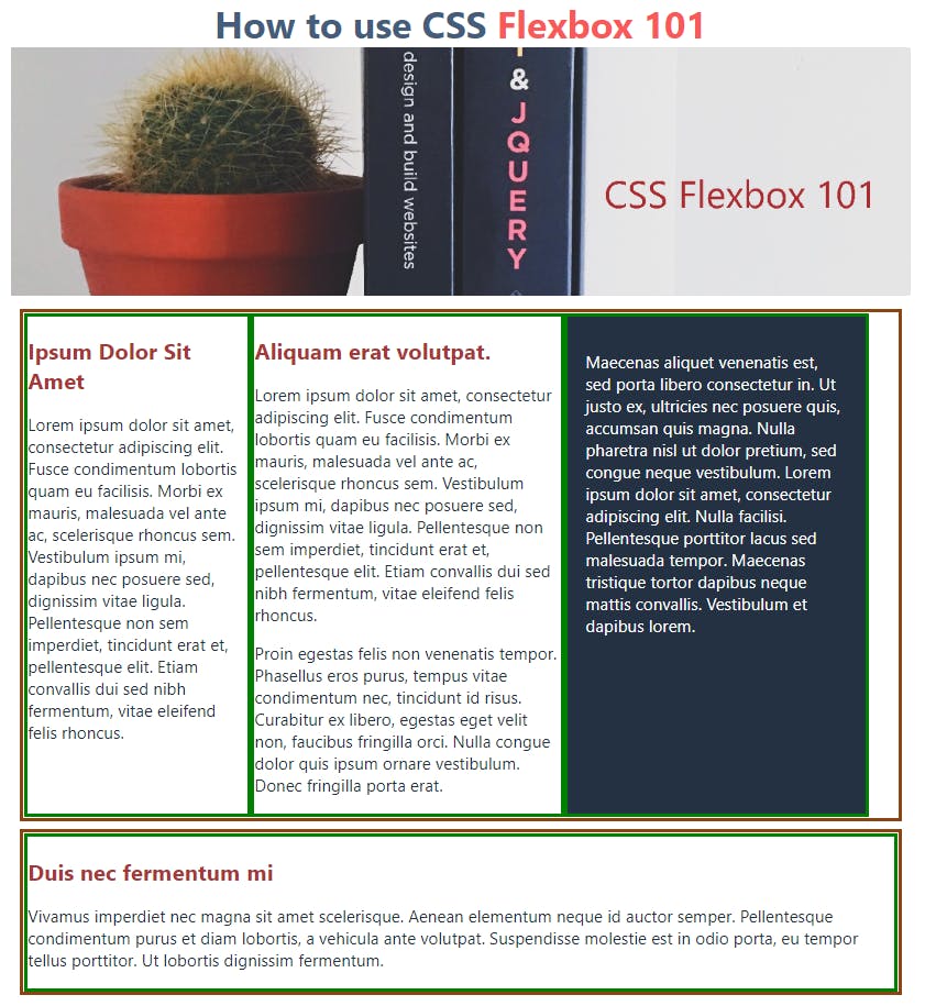
To see the effect of these properties, I had placed some borders on my blog example as you can see in the next image.
Image 1
Now the CSS code that is related to it.
html, body {
 margin: 0px;
 padding: 0px;
 font-size: 1.125rem;
 font-family: -apple-system, BlinkMacSystemFont, 'Segoe UI', Roboto, Oxygen, Ubuntu, Cantarell, 'Open Sans', 'Helvetica Neue', sans-serif
}


img {
    width: 100%;
}

h1 {
    color: #455d7a;
    font-size: 2.5rem;
    margin: 0 auto;
    text-align: center;
}
h1 span {
    color: #f95959;
}

h2 {
    color: #a83737;
    font-size: 1.5rem;
}

.container {
    width: 95%;
    color: #233142;
    margin: 0 auto;
    padding: auto;
    max-width: 1090px;
}

.columns {
    border: 5px saddlebrown solid;
    display: flex;
    /* justify-content: space-between; */
    margin: 0.5em;
}

.col {
    border: 5px green solid;
}
.col1 {
    width: 25%;
}

.col2 {
    width: 35%;
   }

.col3 {
    width: 30%;
}

.col-bg {
    color: #ffffff;
    background-color: #233142;
    padding: 1em;
}
As you can appreciate, all the columns have no space between them and are glued to the right, leaving a white space at the right end.
It doesn't look very good to say.☹️
We will fix this with the justify-content: property.
The "justify-content" property has 3 states.
- space-between
- space-around
- space-evenly
1. Space-between
As you can check in the CSS code, I had commented on the "justify-content property. I will uncomment the first one. Let's see what effect it does.
The class .columns will be set as follow.
.columns {
    border: 5px saddlebrown solid;
    display: flex;
    justify-content: space-between;
    margin: 0.5em;
}
Result =
Image 2
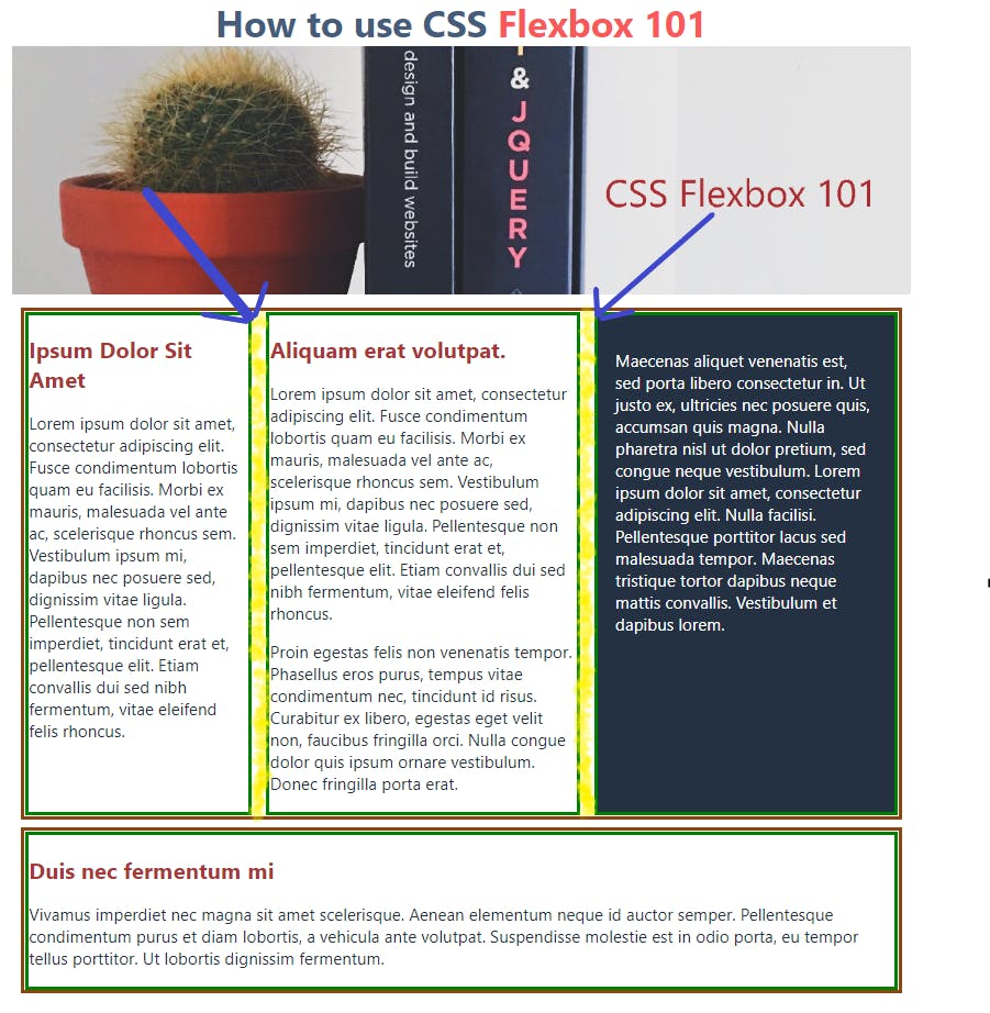
What thejustify-content: space-between; property does is, it takes the white space that was not used at the right of the columns, as you can see in Image 1, and distribute it between the columns with a green border. I filled the spaces in the image with yellow color to show the spacing.
2. Space-around
Image 3
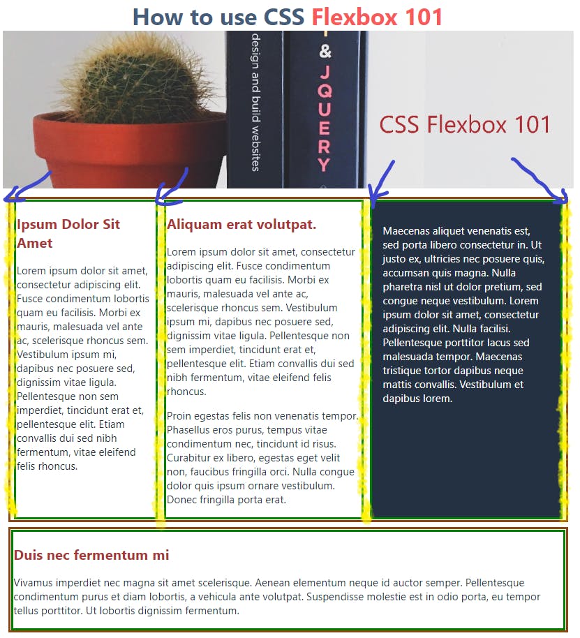 Now, what
 justify-content: space-around; does is, it takes the white space that was not used at the right of the columns, as you can see in Image 1, and distribute it between and around the columns with a green border. I filled the spaces in the image with yellow color to show the spacing.
Last but not least we have...
3. Space-evenly
Image 4
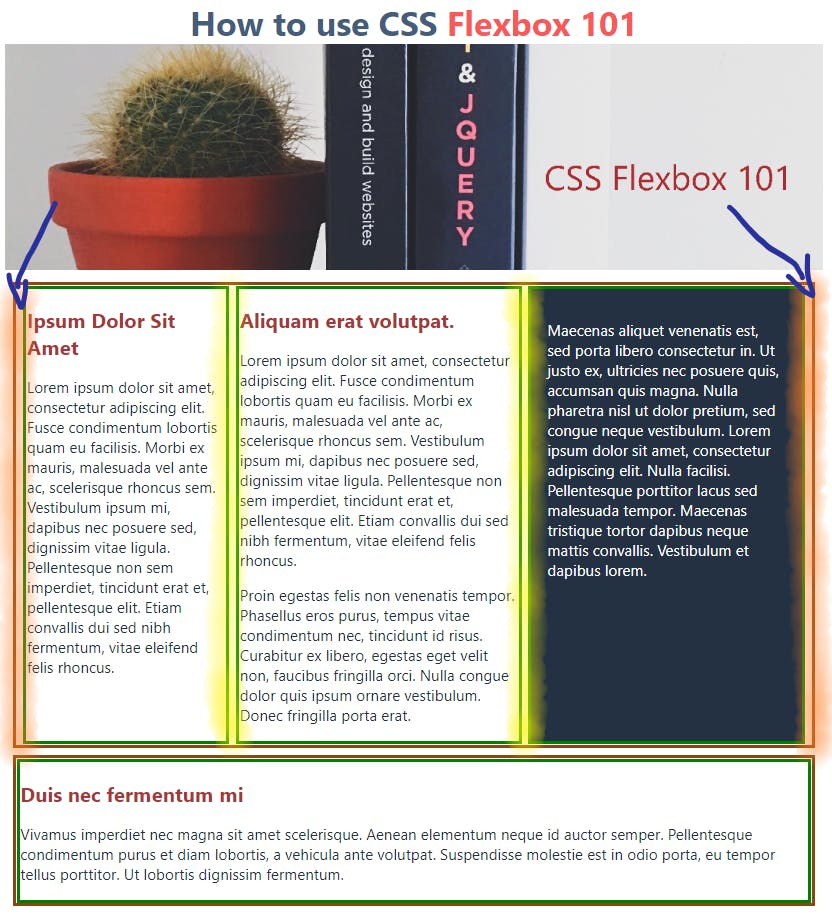
This time, what the justify-content: space-evenly; does, is to take the white space that was not used at the right of the columns, as you can see in Image 1, and distribute it around and evenly, evenly meaning that they put some extra spacing on the borders to distribute the spacing the more equal it can be, as shown in the columns with a green border. I filled the spaces in the image with orange color this time to show the evenly spacing.
This was a little long post. But CSS it's a long concept to study and it's worth it.
Hope I had helped someone here.
Anyway, if you have any questions or observations about this post, please follow me and leave a comment.
Cheers, all! 😉